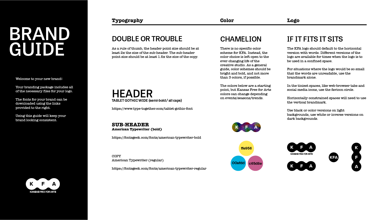
KFA's brand guide was created to make sense of all of the typography applications and different logo variations. The logo has different forms that fit different situations, sizes, backgrounds, etc. The logo itself is inspired by COOP signs painted on grain elevators across the great plains. The circles form connections to each other, symbolizing the small town connections in the Emporia community. The tie-dye color scheme embodies the diversity and freedom that KFA embraces. The gentle curves of the logo give it a friendly and inviting feel.
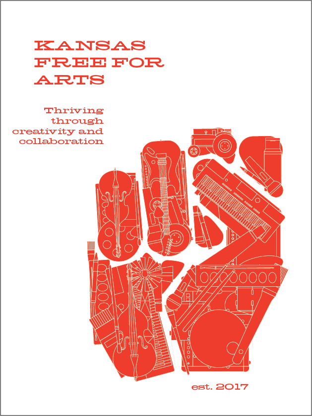
In this poster, musical equipment art supplies, and farming machines combine to form a rising fist that represents freedom and creativity.